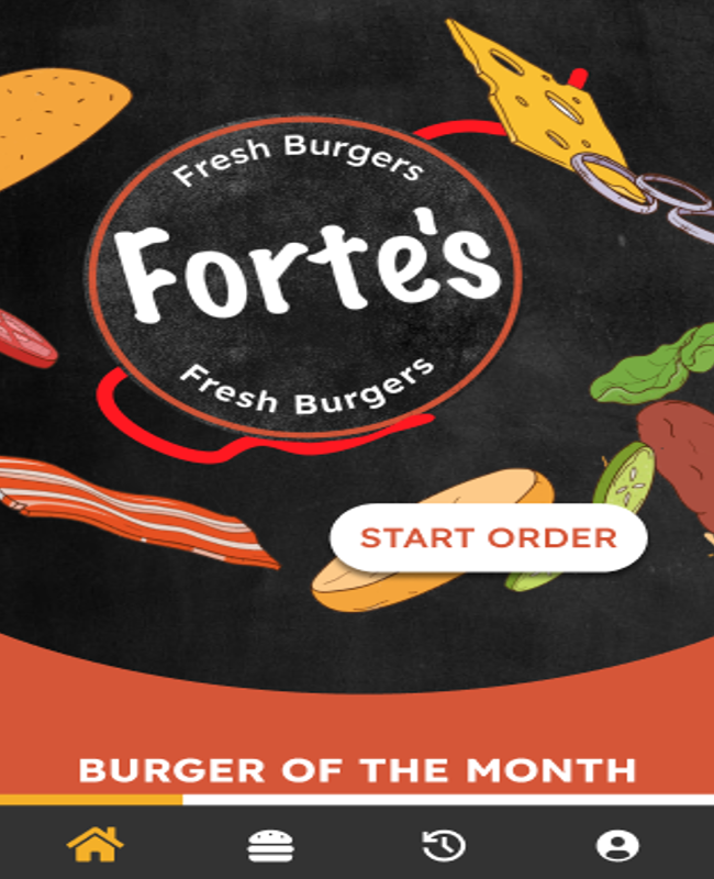
Forte’s Fresh Burgers
The Team
●Kara Butler, Shuyi Cen, Cecilia Chen, Tony Chen, Lauren Lee
Tools Used
Figma, Figjam, Google Forms, Photoshop, After Effects
The Overview
Forte’s Fresh Burgers, formerly known as Five Dollar Fresh Burger Stop, is a food truck located on Market and 33rd, serving burgers and fries to college students and local workers. Our team was familiar with the food truck’s delectable offerings and personable staff so we decided to develop a practical mobile take-out app that reflected their culture. Founder and owner, Damon Forte, was excited to shared his plans to expand the food truck and rebrand to what is being developed as Forte’s Fresh Burgers. We had to take this change into account when designing the interface for the app. In order to design the best product that people would want to use, we also had to think about who our users are and how they would use the app.
The Challenge
Due to the pandemic, the food supply chain has significantly slowed down and resulted in much higher prices with inflation. This has impacted Forte’s Fresh Burgers ability to provide burgers (with fries and a drink) at the price of their former name. Damon Forte, the owner and founder of the food truck, recognized and addressed this by evolving his business with the market. Damon plans to rebrand to focus on the fresh ingredients and recipe he uses. We were challenged to assist in the rebranding efforts which are reflected in the design phase of building our digital product. With some direction, we had to develop a new brand style for the food truck app. Another challenge we faced was the constraint of working with a small menu. This menu was small because it was dependent on the customer’s preferences when customizing the burger. In our fly on the wall observations, we documented earlier in the user flow that each customer had to approach the kiosk ordering system. This system allows for adding different toppings andtaking out others when ordering. In developing the interface, we wanted to stay true to the ability of developing a unique burger to the customer.
The Business
Our team took several steps to better understand Forte's business model and structure. They included having an on-site interview with Damon, gathering observations, and conducting secondary research on the internet from their website, social media accounts, and Yelp. The interview with Damon informed our understanding of the brand’s culture, the target audience, and vision for the food truck. One hope that Damon expressed in his vision was to expand to other university campuses and open a storefront. In our prototype task flow, we considered how the app could be potentially used with different trucks that might have different menu. This is reflected by the location selection at the beginning of the ordering process.
The observation study informed customer behavior and interaction points. Customers began their order at the digital kiosk, which by design, allowed for quick and convenient ordering. A majority of the time was spent after waiting for the food. The longer food took the more restless customers tended to be. In consideration, we made pick-up times for orders adjustable to fit the schedule and need of customers that does not want to wait.
The secondary research informed how customers view the food truck. This confirmed a lot of previous knowledge we had gained from other research. The top takeaway was that the workers treat customers like friends which keep them coming back for the service and affordable prices. While this might be true for a lot of trucks, what makes Forte’s burger stand out is their burger menu and considerations to improving the customer experience through the kiosk, both of which no other local food truck has
The Target Audience
Through fly on the wall observations and an interview with Damon we determined the target audience to be primarily college students, local residents, and working professionals including local workers and Drexel faculty. In our interview, Damon says that he wants to cater specifically towards hungry college students, hence its location. During our fly on the wall observations, our team collected data by staking out during busy hours where it was documented of how many people order food at the food truck, their ages, and occupations. One challenge we met with was gathering this information with a variety of observation times. All of our research was done with at least an hour by each of our team members and trying to collect the most accurate information for the design. Once we collected information on our audience, we formed three user personas to base our design decisions around: the spender, the go getter, and the explorer. We used the main character traits from these personas to determine that we needed an app that was simple to use onthe go, provided important information about the truck's times and location, and let both new and returning users order food quickly. With these goals in mind, we proceeded to develop our design process.
Process and Insight
To begin our process, we had to consider what kind of mood and aesthetics we were going for with this app. We were in the unique position of having a business in the midst of a rebrand, so we had full creativity over colors to choose and general theming. We each created moodboards to convey the sort of vibe we thought we could bring to the apps creation.
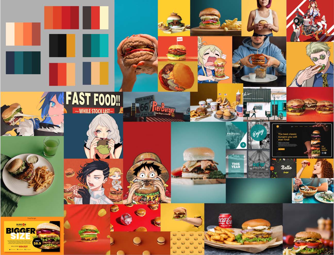
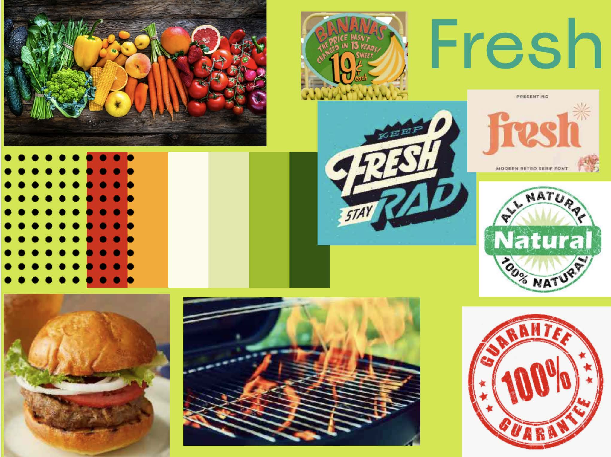
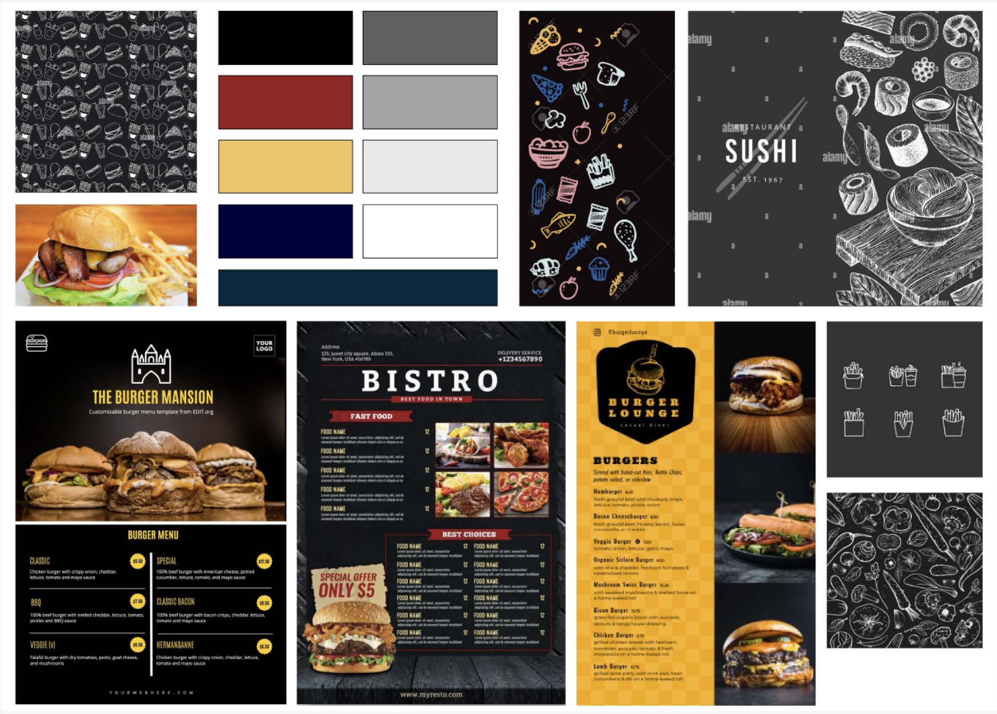
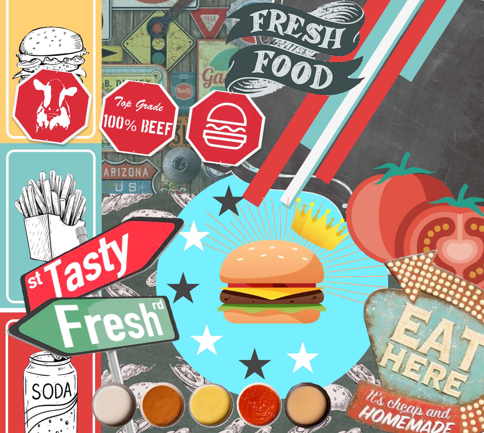
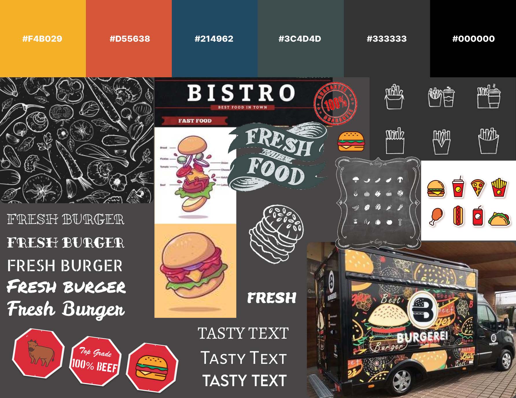
Based on our moodboards, we created one joint one with elements of everyone's involved. We wanted to go for a fun, but established feel. Based on research for colors relating to food, we knew we wanted a red and yellow to be featured prominently as main colors. We also saw a large amount of chalkboard style drawings of fresh ingredients. With freshness being something important to the business, its something we wanted to be sure to include in our design choices. As a result, we decided to take inspiration from chalkboards, food with playful outlines and graphics, and experimental fonts to make our full moodboard:
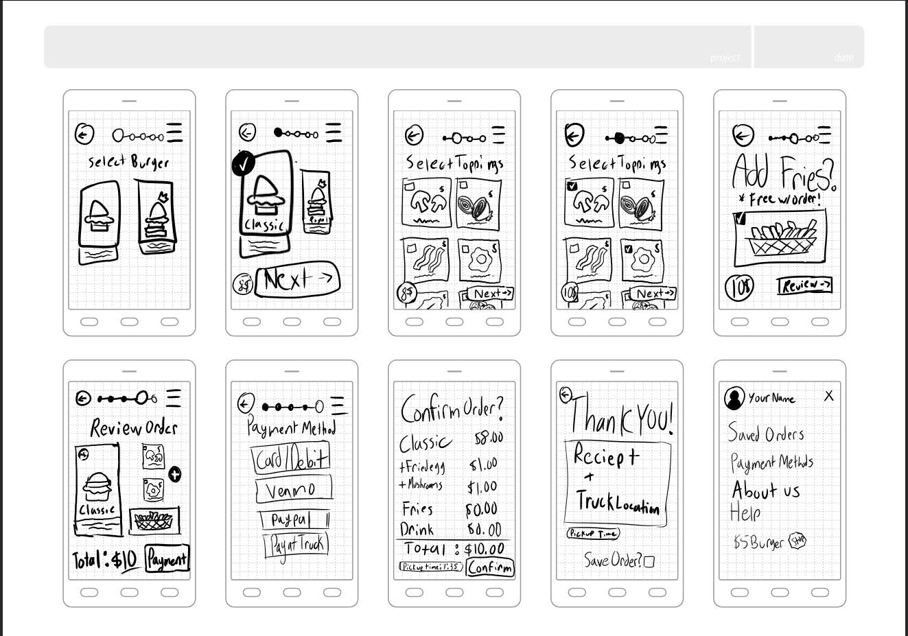
Once we established our branding, we started out framing our ideal ordering process, and making basic sketches to meet our goals. Our main goals were to create a home screen, a menu, an item details view, ability to customize toppings, reviewing our truck, checking out, and our confirmation page. Each of us took the time to brainstorm our own unique ideas via sketches, and then pool them together to make decisions on how to proceed.
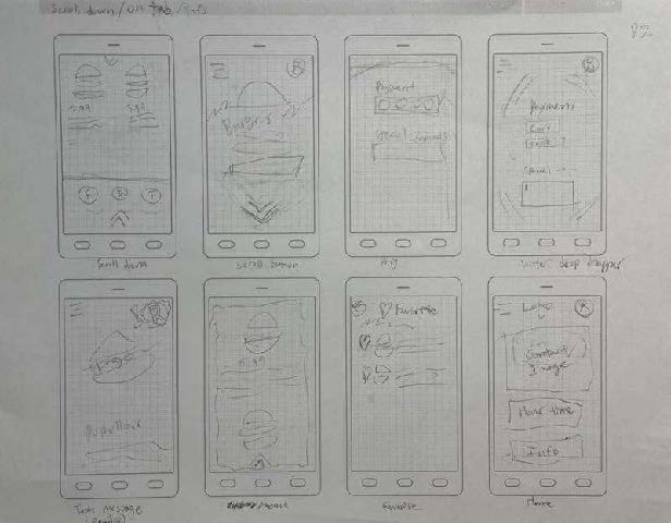
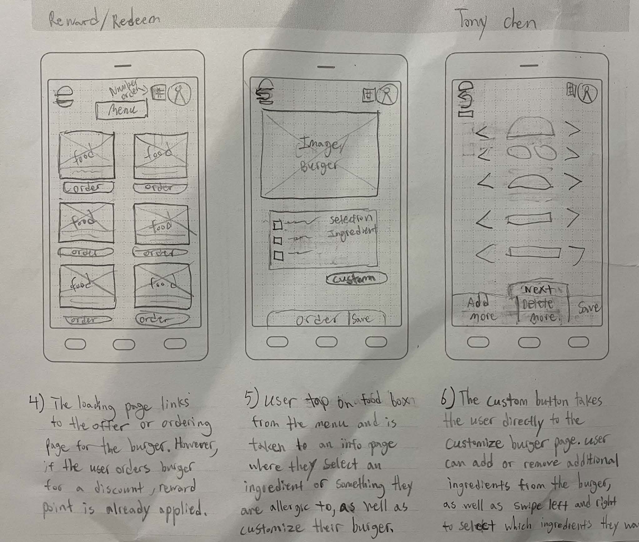
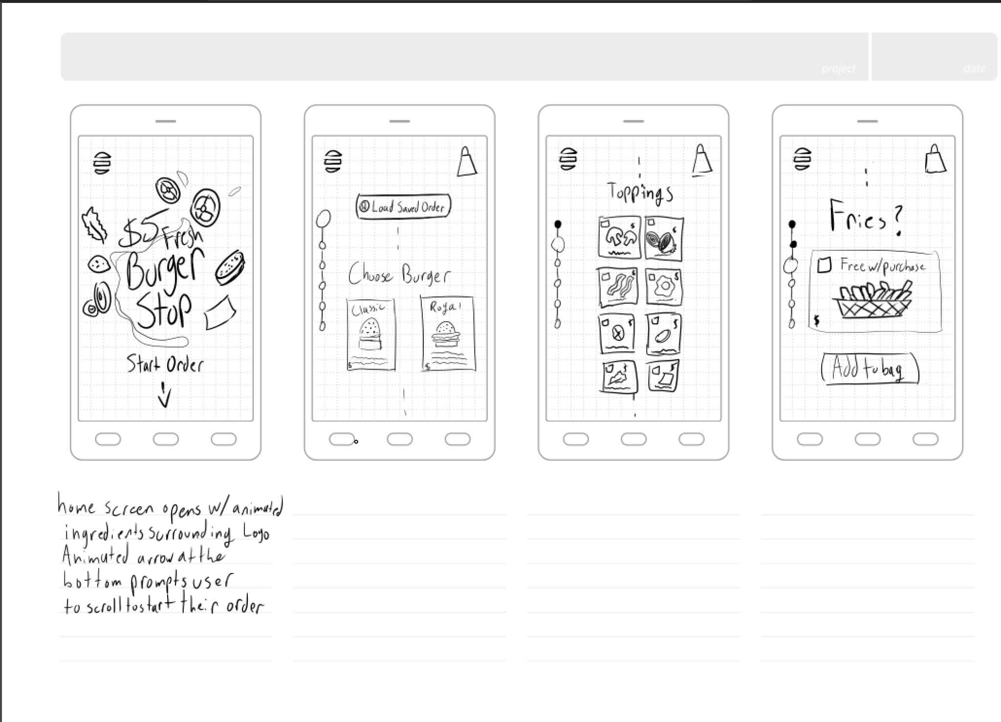
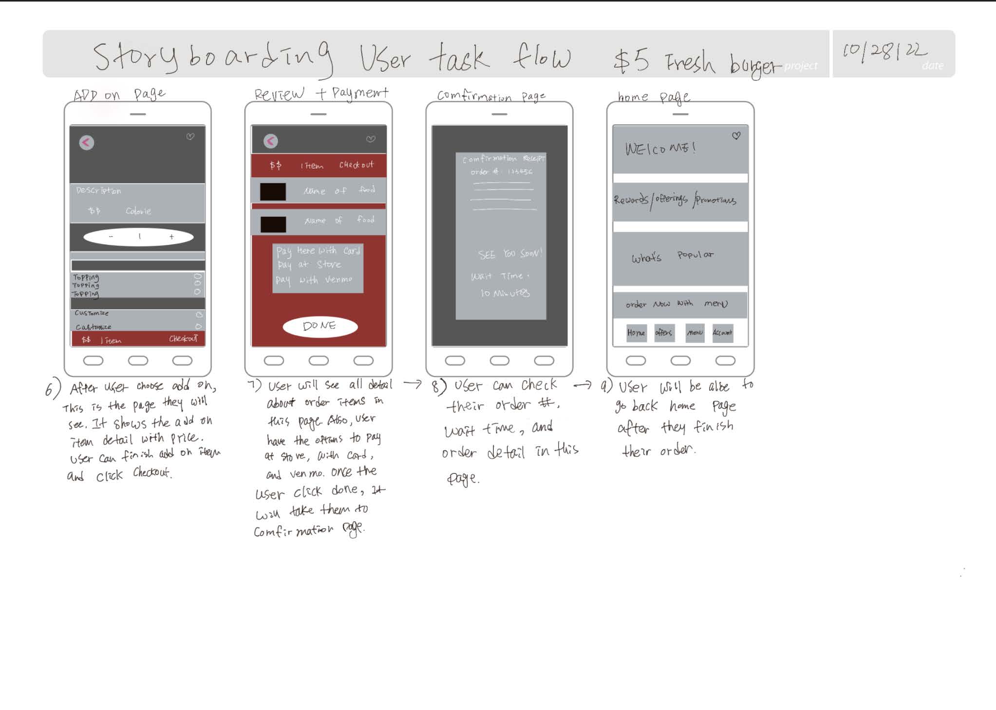
Some of our sketches had our app working as a continuous scroll, while others used buttons to go from page to page. We all completed stages in our discussed flow as necessary, but some sketches included additional pages like account information, notification customization, rewards, and menus. These new ideas that came from the sketches lead us to consider building them into our design, so as we moved to the next round of sketching, we added account creation and rewards to the list of screens we wanted to create.
We used this second round of sketching to establish a concrete flow for ordering food. We also wanted to narrow down our ideas further, while still giving space for creativity and innovation. As we went through our sketches, we began to notice some patterns emerging throughout some such as our hamburger menu (some of which looked like a simplified burger), a rewards bar, and an item description page with ingredients and customization. We decided to use these consistencies as a jumping off point as we began to formulate our low-fidelity prototype based on our collective ideas.
Based on our efforts, we decided on making about 11 screens to get across the idea of our basic task. Our next move was to see if our process was viable, so we conducted our first round of usability testing on paper prototypes of our low fidelity wireframes.
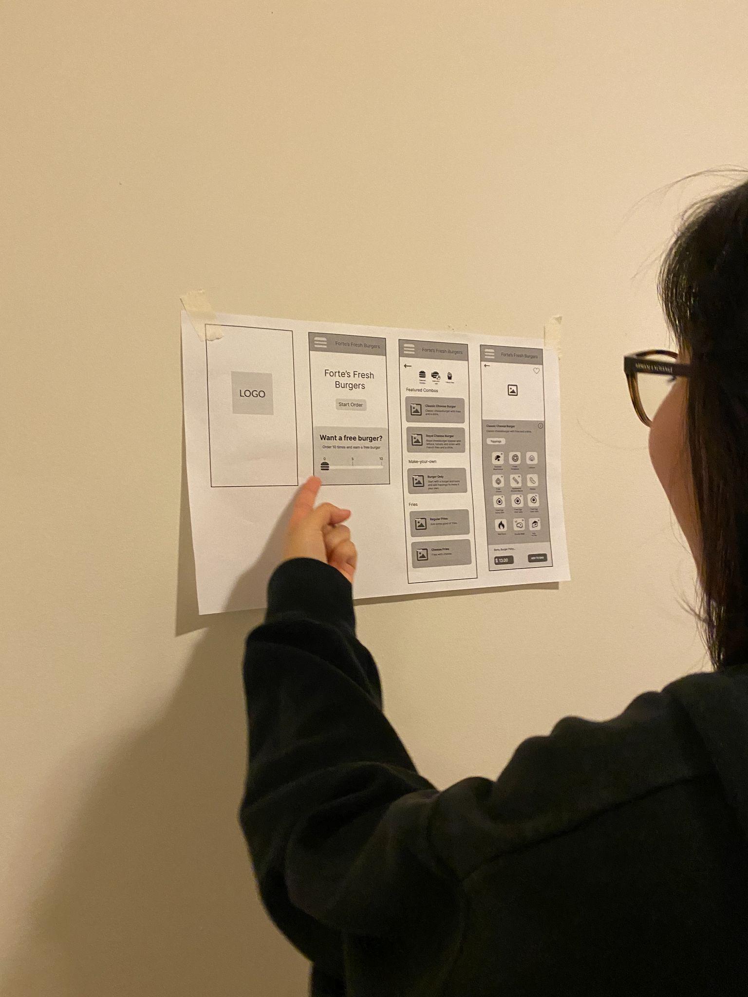
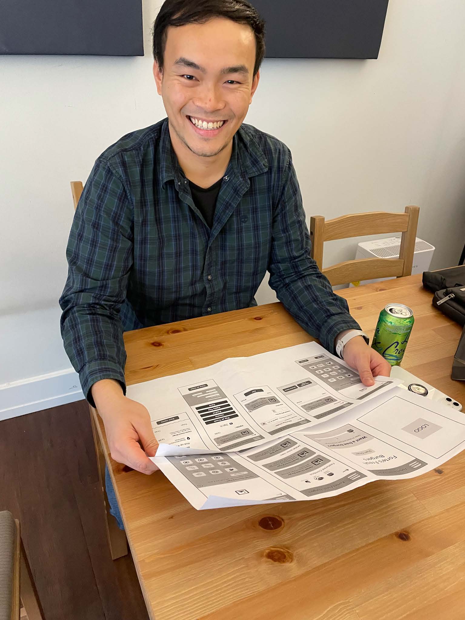
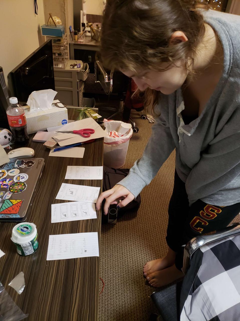
This usability test, like many to come, was very enlightening in terms of what we needed to work on. We received major criticism on the layout of our home page, the layout of our toppings page, and our overall integration of design, even within a low fidelity space. The app would function standardly, but it was lacking any unique features or wow moments that would allow it to stand out from its competitors. We feared that our combination of ideas may have unintentionally led to a cookie-cutter design, so as we went into our mid-fidelity testing, we made an effort to regain that spark and gave everyone a chance to redo any page with no restrictions and then present it in our meeting.
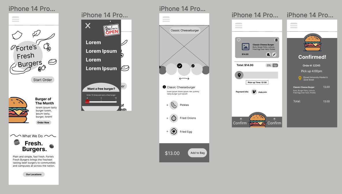
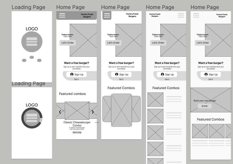
This restructuring of thought allowed us to think outside of the box and apply some new creative ideas we hadn't considered before. We kept ideas in how to change our homepage to include elements like our logo, a burger of the month, and a business mission statement.
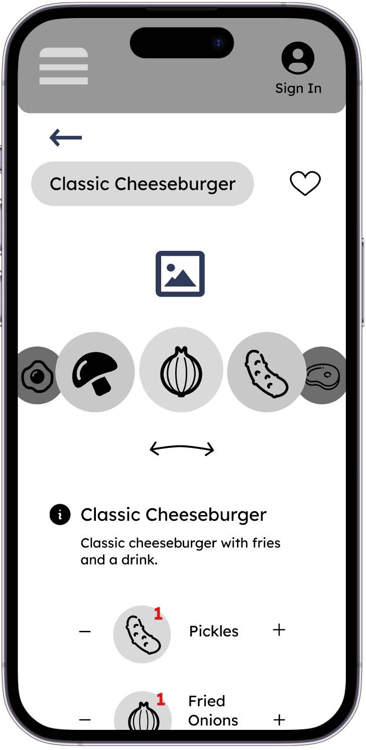
For our toppings page, we abandoned the idea of a grid for individual toppings, and instead put our items on a carousel beneath a graphic of the burger to engage customers while customizing. Later variations included the text underneath for each individual item.
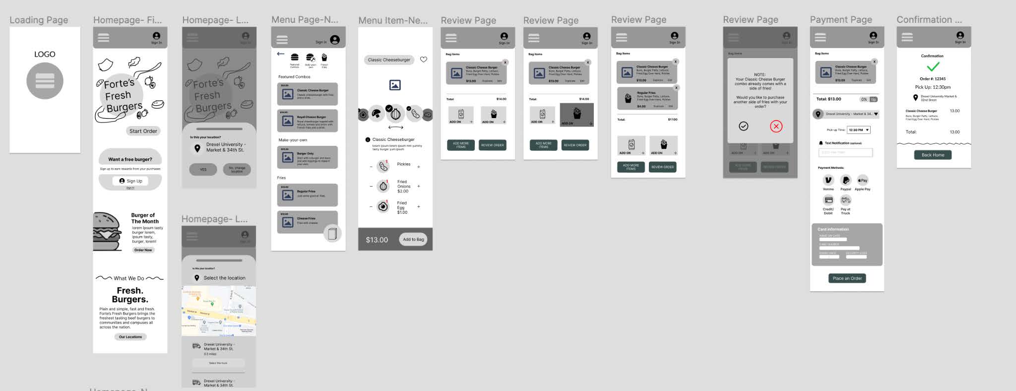
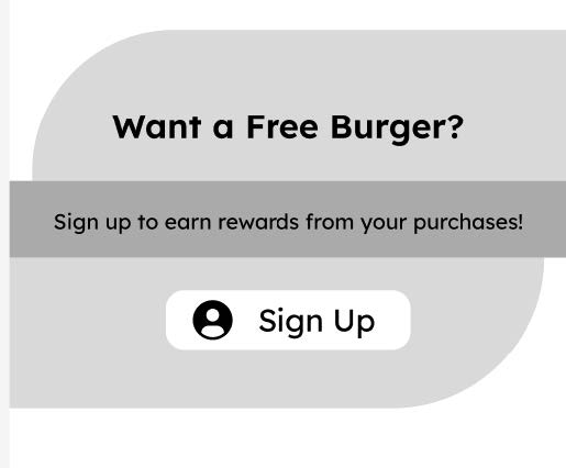
With our new changes starting to develop and more character being built into the design, we proceeded with our next round of usability testing on our newly built wireframes. Our comments started to reflect that our changes were making a difference. We received positive feedback on our home screen and toppings changes. One new area that we needed to work on was the prototype itself. With so few screens, the functionality wasn't robust enough to handle multiple courses of action. While the app would normally work in production, the prototype does still influence the users perception of usability, it was important to us that we improve that experience. Another issue was with our rewards display, we had changed it but it was seen as far too intrusive in its position and space on the home page.
Including the paper prototypes, low fidelity, and mid fidelity wireframes, we conducted a total of 20 usability tests to shape our high fidelity design.
Solution
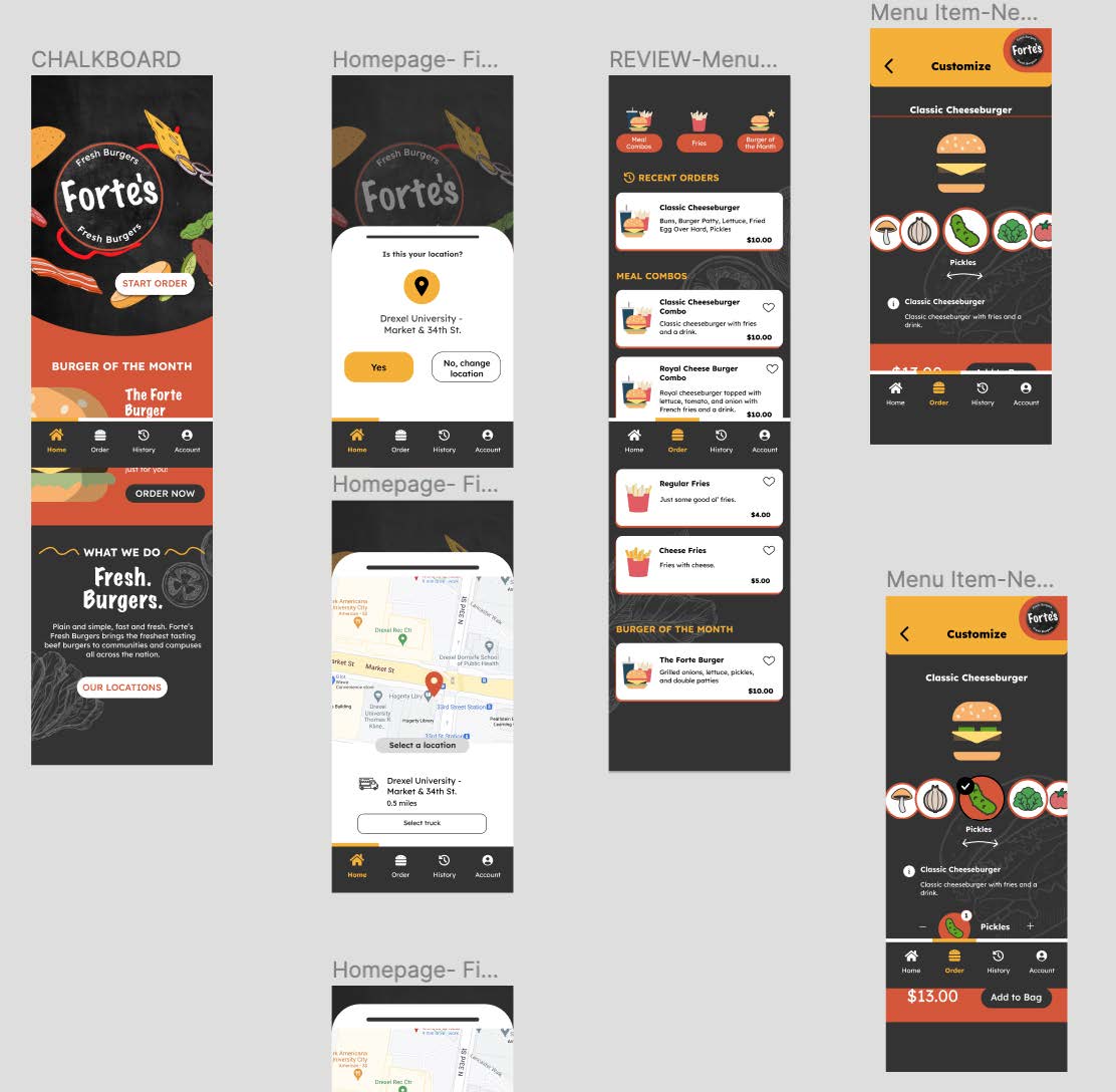
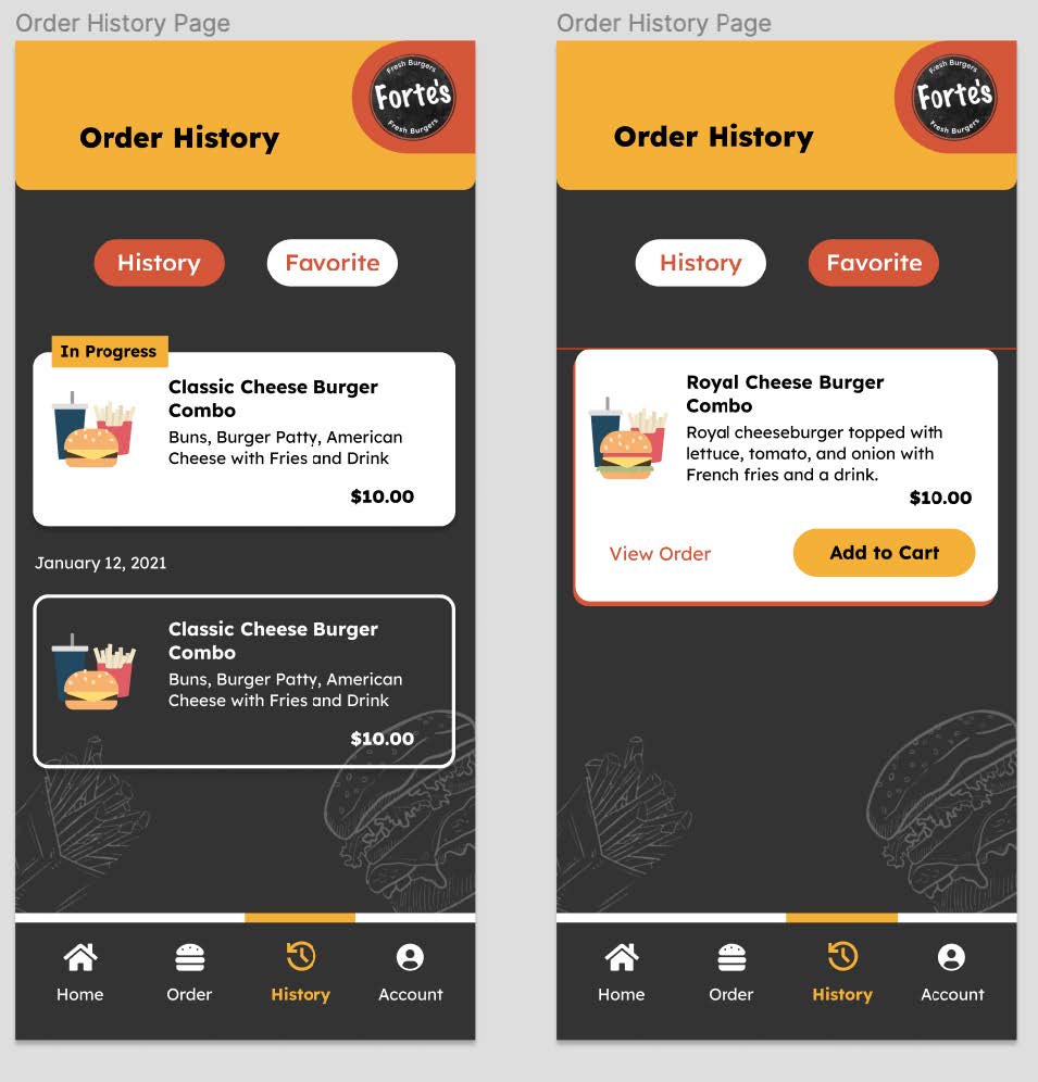
The clear pivots our team made between low-fidelity wireframes to high-fidelity wireframes are the color pattern, adding account page, order history, and adding tracking food order function at the home page. One finding our team made from research that informed key elements of the app is that our app provides multiple payment methods such as venmo, apple pay, google pay, pay at truck and credit card. From the research and interview, there are several feedbacks about how to track order. Therefore, our team decided to design an order history page which comes with history and favorites. According to Kang from the interview: “ I like the color of your team’s design for the app.” The color pattern such as black, red, grey, blue and yellow that our team design is based on the mood board our team members design at the beginning of the team. Another big change that we made was with our navigation. Originally we had a header at the top with a hamburger menu, but we realized that the standard for many food apps included a navigation bar at the bottom. To make our structure make sense, we decided to get rid of our header, and turn our footer into a nav. This allowed us to take our rewards off of the homepage to make for a cleaner experience, and consolidate the menu to not include favorites. We included a number of tasks in our prototype including the ability to customize a burger, sign into an account, view order history and current orders, choose pickup time, select location, and more. We wanted to take care to build out a robust prototype that matches what the development of this app would look like as much as we could.
Takeaways
When it comes to the final product of our research and design, we see major progress towards potentially defining this brand, and giving it its own real identity through this app. We hope to share our findings with Damon himself to help give him a vision for what students are truly looking for in his food truck.
If we had more time, we'd like to conduct even more testing based on what is currently our final design. Our process has revolved around ideation, designing, and testing this whole time, so to have a final design with changes that have not been tested is not our ideal situation. Another change we'd add is working on a solid style guide and implementing a defined design system. By having usage and standards laid out plainly, it would facilitate an easier handoff between designers and developers and result in consistency throughout the brand without sacrificing identity. With more time, we'd like to consider building out even more pages like a page that shows the sauces and drinks they have at the truck, or an "about us" page with social media links, our mission statement, and more. We'd also consider more consistent iconography, and possibly including some pictures of real food from the truck.
With the threat of scope creep always looming, our team did our best to focus on our most attainable goals and we feel as though we met them successfully. Collaborating with a team this size taught about the value of meeting consistently, and making sure that everyone was included in the discussion. To submit several assignments as a team per week, we needed to make sure we met at least once a week. Oftentimes, we met two or three times a week because our time together to discuss proved to be invaluable. Having a mix of constant digital and in person communication was important for us, and allowed us to keep each other in the loop for any changes being made or things that needed to get done. We also learned the importance of collaborating and hearing out everyone's ideas. Not every thought or design is going to be a winner, but the process of experimenting with new ideas and thinking outside of the box breeds innovation, and that eventually translated to functioning ideas we were able to implement in our final design. A number of us also learned new skills in figma, such as creating and animating components and using figma's design libraries. It was a learning experience for all of us, and we came out with new insights on
Conclusion
Overall, we think the final product was the best we could have produced, and we consider this project to be a huge success thanks to the usability testing, user feedback, branding, and other factors that helped to promote the prototype. Although some users had trouble understanding the prototypes that the designers believed would be best for users, users always know what's best for themselves, so we learned that designers don't always understand what users think. Our team also wants to share this prototype with the world because this term has taught us a lot in terms of research and design.
